Uploaded image for project: 'Talend Component Kit'
  1. Talend Component Kit
  2. TCOMP-1018

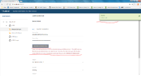
the error information show location is different with success information, expect the same

Apply templateInsert Lucidchart Diagram
    XMLWordPrintable

Details

    • New Feature
    • Resolution: Suggestion noted
    • Minor
    • None
    • None
    • None
    • None
    • All
    • Hide

      it was intended, rational was:

      1. error are aligned with form errors
      2. success must not pollute the UI

      It is close to what we have in apps (talend cloud) so for now we will keep it this way since the app should stay close to real apps.

      Show
      it was intended, rational was: 1. error are aligned with form errors 2. success must not pollute the UI It is close to what we have in apps (talend cloud) so for now we will keep it this way since the app should stay close to real apps.
    • GreenHopper Ranking:
      0|i19yaj:
    • 9223372036854775807
    • Small

    Description

      Please see the Capture.png, three issues here :
      1. the error information show location is different with success information, expect the same
      2. the button for validation's color is not good , green is better?
      3. the success information don't disappear, it will show for ever if you don't close it
      Attachments

        Activity

          People

            Unassigned Unassigned
            wwang Wei Wang
            Votes:
            0 Vote for this issue
            Watchers:
            3 Start watching this issue

            Dates

              Created:
              Updated:
              Resolved: